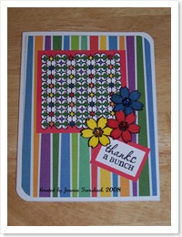
Happy Sunday to you! I was able to get out to my craft room again today. Yippee! I had so many cards I wanted to try but only two came into fruition. The girls were a little needy while we were in my room and, let's face it, I'm a slow creator! But what I liked the most about what I made today is the fact that I used the same stamp set for both cards, but by using different colors, the look and feel is completely different.
First up is a fun primary colored card that was inspired by  this one on the Verve Visual blog. It looks a little crooked, but it's the stripes. I didn't think it was as obvious as it looks in the picture. May have to use some Un-Do and fix that. LOL I used my markers...mostly Sharpies on this. Kathi, I think you are right...this coloring can become addicting. (hee, hee) That striped paper is part of a paper deck I bought at Target. It's by Marcella by K and called Birthday Mat Deck. It's nice because one side is a pattern and the other side is a coordinating solid. The stamp set is called Grateful Elegance. I added the flowers in a way to add some dimension. The red one has a pop dot, the blue has some foam tape and the yellow is just adhered. The centers are jewels I found at Hobby Lobby in the bead/jewelry section.
Next up, is my version of this card found on the Verve blog. I used the same stamp set with Cocoa, Chocolate, Colonial White, and Baby Pink cardstock colors. I used Hollyhock and Cocoa ink (all CTMH). The border was punched using a Martha Stewart punch. The pearls are from Hobby Lobby. I'm pretty sure that ribbon is from Michaels.
That does it for me today. I signed up for a class called Type + Writer on Jessica Sprague and it starts tomorrow and runs for two weeks. I'll bet I just might have some digi layouts to share during the course of this class. Ü
Til next time, thanks for visiting!
Jeanne


Wow, Jeanne! Great cards! I like how you showed the same stamp set and two different looks. Boy, these are nice! TFS!
ReplyDeleteBoy these are some great cards! Don't you hate to send them to people thinking they will toss them? They should be framed!
ReplyDeleteGreat cards! I love the bright colors and the pink and brown one is so classy looking. Have you seen the previews for Verve's new release? These monthly releases are living proof of how fast time goes by . . . I can't keep up! Have a great week!
ReplyDeleteLOVING the brown and pink one -- so frilly and girly.
ReplyDeleteI love them both! So very different and just beautiful! I can't wait to see how the scarves come out ;) Miss ya! Big hugs!
ReplyDeleteI really had to do a double take. It IS the same stamp! I love them. I'm glad you're back in your stamp zone, too. Keep 'em coming! TFS
ReplyDelete