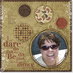
I realized, that I goofed on my layout after I read Kathi's comment that she couldn't read the small type. When I enlarged it to try to read the text, I saw I had copied one of the text circles and put it around a new circle, but forgot to change the text! oops! Goes to show how you "see" what you expect to see sometimes. I also thought, since the text IS small, I'd share just what is written around those circles.
Here's the layout again, fixed this time (I hope)!
We were to free write about ourselves. Liv gave us a plethora of topic starters. From that we were to glean several items to type in around the circles of paper. The items/words are the text that is typed in around the circle
I am:
Lost without (brown circle) Diet Coke, internet access, contact lenses, a little solitude, vehicle to get out and about
Calmed by (paisley circle) reading before sleeping, Freecell game, brushing hair, hugs and kisses, being still, warm fragrant bath, a smile
Blessed with (yellowish and black circle) two awesome daughters, a tolerant hubby, a nice house, fantastic friends, a love for life, desire to create, curiosity
Indulging in (orange circle) chocolate, buttered popcorn, blogs, digi-scrapping, stamping, creating
In between each word is a "dingbat" or picture of a heart in a square
The quote word art is another lesson Jessica taught us. She showed and explained how best to take a quotation (this one is one she had on her layout and I really liked it, so I chose to use it) and emphasize different words in the quote by changing the size of the word and arranging the words in a visually pleasing way.
I hope this helps the layout make more sense. And maybe you learned a tidbit about me you didn't know before?! LOL
Thanks, Kathi, you helped me big time tonight and you didn't even know it! Ü
Til next time...hopefully tomorrow... because Erin challenged me to do a certain technique and I hope to be able to create something worth sharing. How's THAT for a teaser? LOL
Jeanne

4 comments:
Wow, Jeanne! Great layout! I love how you have the journaling around the circles. Great job!
That is such a beautiful LO, Jeanne! Not just in the photo (which is such a great pic of you, BTW!), but in your choice of journaling style. And I like what you did with the title too...you did a great job with your new lesson! Thanks so much for letting us get a little glimpse of what makes you happy. ;)
I can't like this one anymore than I did the first! I smile back everytime I look at it!!
Isn't this just the greatest class? Not only do we learn all these wonderful techniques, but we learn how to express ourselves and think more deeply (don't you just love my new and improved writing style?) Great LO you created!
Post a Comment