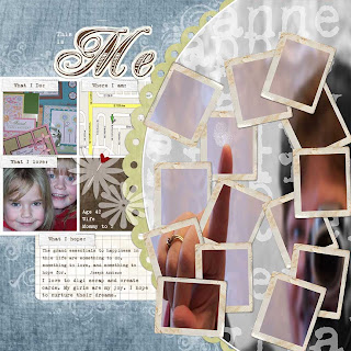
First, there were some technical difficulties that made the lesson offline for a couple of hours. I had gotten through 3 tasks at that point. Then there's those pesky kids that keep distracting me (just kidding...about the pesky part). Then when I sat down again last night, I realized I blurred myself too much and had to start ALL over again. I even worked a bit past my bedtime to try to get it done, but decided my being tired might open the way to making mistakes.
Remember my mentioning that I had to take a particular photo? Well, we were to take a picture of ourselves pointing in a mirror and get the reflection with the focus being on the finger, not ourselves. Um, okay, I am game, even though most of my pictures are happy accidents-this one being NO exception. It took several attempts over 3 days to finally get this one that I chose to use.
This layout is WAY out of my comfort zone stylistically (<---I spell checked and that is spelled correctly :o) ) but the techniques I learned were SO very cool! Making the photo blurrier, while keeping the finger in focus is one. Making those frames that show the parts in color...fantastic! Text as texture in the background of the picture-WoW. Scanning in our fingerprint and adding it as an element...never would have thought of that in a million years. Being able to make those ghosted flowers-fabulous!
 credits
NRJ PDQ Patters: From PDQ Textures Vol. 6 set by Nancie Rowe Janitz
Grid notebook paper: from Notebook Paper Pack by Katie Pertiet
Journaling strip: from Stitched Journaling Strips set by Katie Pertiet
Grungy flourish brush: from Grungy Clusters Brushes-n-Stamps by Katie Pertiet Torn frame: from Photo Booth Frames by Katie Pertiet
Heart pin: from Apron Strings kit by Leora Sanford
What We Learned
At the end of this lesson, you'll be able to:
Install a Photoshop .pat file
Create a custom background from pattern adjustment layers
Use Photoshop to “fake” a shallow depth of field on a photo
Create a multi-photo effect using masks and a .png frame
Experiment using text as texture
Create a lacy edge on a scalloped circle
Use the Rounded Rectangle tool to create a journaling block
Use the Burn tool with grunge brushes
Create semi-transparent ghost shapes
Hope it was worth the wait. :o)

5 comments:
Your layout is unbelievable. I am SO impressed! I honestly don't know if I'd have it in me to learn that much - the old head is pretty full!! As for the Papertrey release, I really like everything that's new but received an order from them today and will have to wait to order more . . . Thanks for sharing your layout. I can't wait to see what you do/learn next!
I love this! Ya kind of disappointed me in the beginning (telling me that I wouldn't see your layout), but then I scrolled down! Wahoo!
This was a great assignment, wasn't it? I lose my breath every time and yell at the computer, "Wait, wait!!" In the end, it is all worth it! (But the class is not for the faint of heart or easily frustrated!)
Congratulations on completing this EXTRAORDINARY layout! Don't you feel just proud? Your photos are really good, and I like the poem you included on the journaling tag. And I really like the way you wrote out the specific tasks/accomplishments in the learning process under your lo. We've come a long way since Up and Running!
This week's lo is good too....we are learning so much aren't we?
This came out awesome. You are the crafting QUEEN... I can't get over all beautiful the stuff you make!
Post a Comment